Net-A-Porter: Transitioning to Responsive Design and AWS
Moving to a mobile first world whilst revisiting key parts of the funnel.
Brief Context:
Net-A-Porter’s website operated on separate codebases for mobile and desktop, making updates complex and resource-intensive. As part of a large-scale initiative, the business aimed to transition to a single responsive design while migrating the platform to AWS to improve performance, scalability, and reliability. This project also served as the starting point for developing a design system to streamline future enhancements and ensure consistency.
Challenges:
1. Managing the transition from two distinct codebases to a unified responsive design, ensuring continuity across the entire site.
2. Redesigning key sections of the website and customer funnel to accommodate responsive behavior without compromising the brand’s high standards.
3. Aligning multiple teams, including Marketing, Content Writing, Visual Merchandising, and Studio, to a shared vision.
4. Establishing scalable design patterns that could form the foundation of a future design system.
Results:
• Increased conversion rate, longer time spent on listing pages and product detail pages, increased customer engagement with editorial, increased average order value.
• Delivered a cohesive, responsive website that brought maintenance cost down and reduced technical debt as much as it improved cross-channel user experience.
• From a performance perspective, it enabled faster page load times and greater reliability through AWS migration, enhancing overall performance.
• Established scalable design patterns that evolved into a full-fledged design system in subsequent phases.
• Fostered cross-departmental collaboration, setting a precedent for future design-led initiatives. This project provided hands-on experience with large-scale transformations and highlighted the importance of responsive design and scalable digital infrastructure in creating world-class user experiences.
Team & my role:
I was a mid-level designer in a cross-disciplinary team that included senior designers, product managers, developers, and external stakeholders. My role focused on contributing to workshops, prototyping, usability testing, and refining designs for responsive behavior.
How we did it:
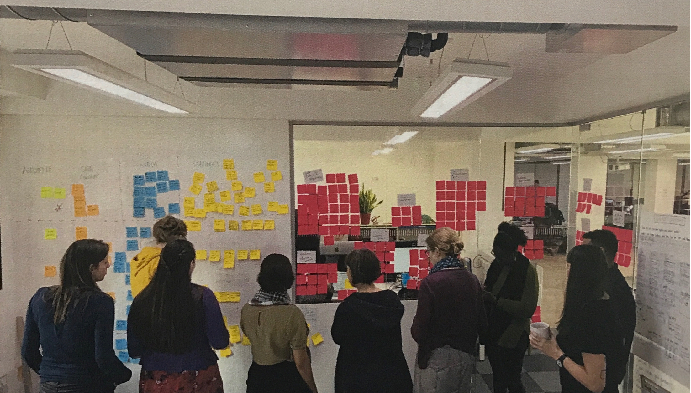
1. Workshops for alignment: Conducted collaborative workshops for each section of the website and the customer funnel, bringing together stakeholders to capture requirements, generate ideas, and review priorities. These sessions ensured alignment across departments and addressed unique challenges posed by transitioning to responsive design.
2. Prototyping and usability testing: Created and tested prototypes to validate responsive layouts and navigation patterns, ensuring they worked effectively across devices. Leveraged user feedback to refine designs iteratively.
3. Performance optimization with AWS: Collaborated with developers and engineers during the AWS migration to ensure that design assets and functionalities were optimized for faster load times and improved reliability.
4. Laying the foundation for a design system: Helped define initial design patterns, reusable components, and documentation to support consistency in responsive design.

.svg)


